
(Text by Jenneke Krüger)
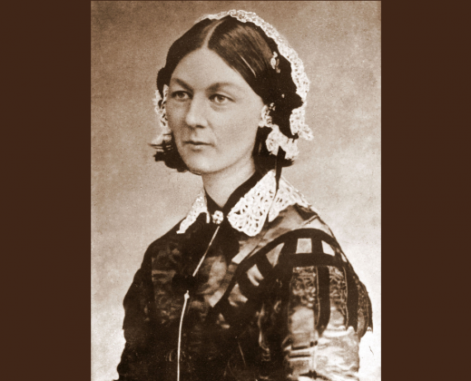
Florence Nightingale was very conscientious in collecting numerical data. Even in the harsh conditions during the Crimean War, she meticulously noted number of patients, causes of deaths and death rates. Data which she used later on to create, with Farr, the famous ‘coxcomb’ diagrams (see Figure 1).
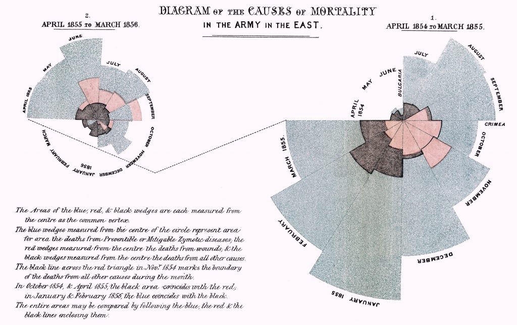
In these diagrams all areas are measured from the centre. The red area represents deaths from wounds, the blue area deaths from preventable and contagious diseases, and the black area deaths from other causes. Note that in October 1854 and April 1855 the number of deaths from wounds and deaths from other causes are about equal. In March 1855 the staff and nurses started with attempts to improve sanitation.
Even though Nightingale’s work was praised by statisticians and other scientists in the 19th and 20th century, her reputation was severely damaged in the 1990s. She was accused by an Australian medical historian of causing the high death rates in the military hospitals, as she was responsible for the unhygienic conditions. Since the author included many references his book got positive reviews and his statements were dispersed in the popular press. Apparently nobody had checked his ‘facts’, until Lynn MacDonald convincingly showed that this author had misrepresented and misinterpreted numerical data and had completely ignored the different conditions in the various hospitals at the time of the Crimean War (MacDonald, 2015).
So, as both Nightingale and Farr would tell you: CHECK THE FACTS (even if they come from a respectable author).
Sources:
MacDonald (2015): http://dx.doi.org/10.5539/ijsp.v5n1p28
Figure 1: https://www2.stetson.edu/~jrasp/stat301/homework/nightingale.htm